 by Neil Cotton
In the now annual summer ritual of new kit releases it is not unusual to see a full range of emotions on display; from eager expectation to full-blown anxiety.
Fans queuing outside the club shop on the appointed release day may do so with a sense of Christmas-morning excitement, or with a sense of resignation that, like a bad haircut, it will only be a short time until it’s time for a new one.
Any failure to respect established club traditions is also likely to result in much controversy – Southampton fans are still recovering from the trauma imposed by the brief hiatus of the club’s red and white stripes.
By contrast, even in an atmosphere as highly charged as this, the unveiling of the design for the goalkeeper’s kit is highly unlikely to stir anything more than fleeting interest.
Maybe this is because few fans will ever purchase one – aside from the sort of aspiring goalkeeper types usually seen milling around local 5-a-side centres – but perhaps it is because goalkeepers’ kits these days have become so bland, so boring even, as to be virtually unnoticeable.
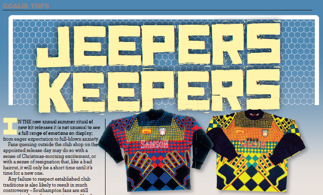
Today’s range of conservative keepers’ kits are a far cry from the flamboyant jerseys which predominated in the 1990s.
This was the time when new printing technologies provided designers with greater possibilities and although there was an existing traditional grammar for goalkeepers’ kit – mainly of muted greens, blacks, greys and the occasional yellow – few clubs or fans had any real preference, or investment, in one colour combination or pattern over another.
With looser rules, there was therefore greater freedom to innovate. Along with third kits, which also provided designers with a blank slate un-impinged by a need to heed tradition, goalkeepers’ jerseys were in the vanguard of a headlong rush towards garishness.
The most famous exponent of this movement was Jorge Campos, the Mexican international goalkeeper who reputedly designed his own kits and whose acid-trip fluorescent jersey and shorts combo was a highlight of World Cup USA ’94, and which makes him a cult figure to this day.
Such luridness had, though, been the norm and was embraced around the globe; from the highly popular explosion-in-a-paint-factory look, as seen on Huddersfield Town’s 93-94 keeper’s shirt, which managed to combine pink, yellow, green, red and blue among other shades, to the Estonian national team’s 1996 design whose aztec-like patterns were positively headache inducing.
Special mention also deserves to go to Sunderland’s mid-90s goalkeeper’s shirt which featured the outline of a pair of hands and which was, being charitable, the best thing that could be said about the kit.
Indeed, many of the goalkeepers’ kits of the era were hideous monstrosities, therefore the eventual counter-reformation which saw a return to a more traditional plainness should surely be seen as a welcome development.
But with even Jorge Campos’ successors in the Mexico goal now reverting to a plain unassuming kit, the passing of the era of garishness should instead be mourned.
As well as flying in the face of the commercial trudge of the game by producing kits which were virtually unmarketable, they were an outward reflection of the individuality and eccentricity which was once so highly prized in custodians and which now, in a blander age, deserves to be cherished.


Book Reviews
Book Review: Chris Towers finds right mix

Book Reviews
Book Review: Sir Geoff Hurst hits net


