Juventus are a club that don’t do much wrong – they have won the past five Serie A titles after all – but holy Christ have they ballsed up here.
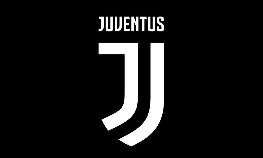
Obviously bored of winning all the time, the Bianconeri have been busy with their crayons and unveiled a new club crest last night, a stylised black and white letter J in the shape of a shield, to replace the classic current logo – and it’s a bit rubbish.
Agnelli: “This new logo is a symbol of the Juventus way of living.” #2beJUVENTUS pic.twitter.com/x5B3fapqGJ
— JuventusFC (@juventusfcen) January 16, 2017
The new crest is more befitting of a tacky clothing brand than one of the world’s grandest clubs, yet apparently a year’s research went into creating the design. One year to tipex two wonky Js next to each other. Twelve months well spent, then.
Obviously, social media has been taking the piss.
Try not to rotate the new #Juventus logo sideways. It’s not a good look. pic.twitter.com/BFVvH04lXX
— footballitalia (@footballitalia) January 16, 2017
.@juventusfcen pic.twitter.com/bj9A1opJIh
— Jordan Herald (@JordanHerald5) January 16, 2017
EXCLUSIVE:
The artist who made the new Juventus logo… @juventusfcen pic.twitter.com/Nf3GVyYa0g
— #WatfordFC Status (@WatfordStatus) January 16, 2017
The moral of the story here is: if it ain’t broke, don’t fix it.